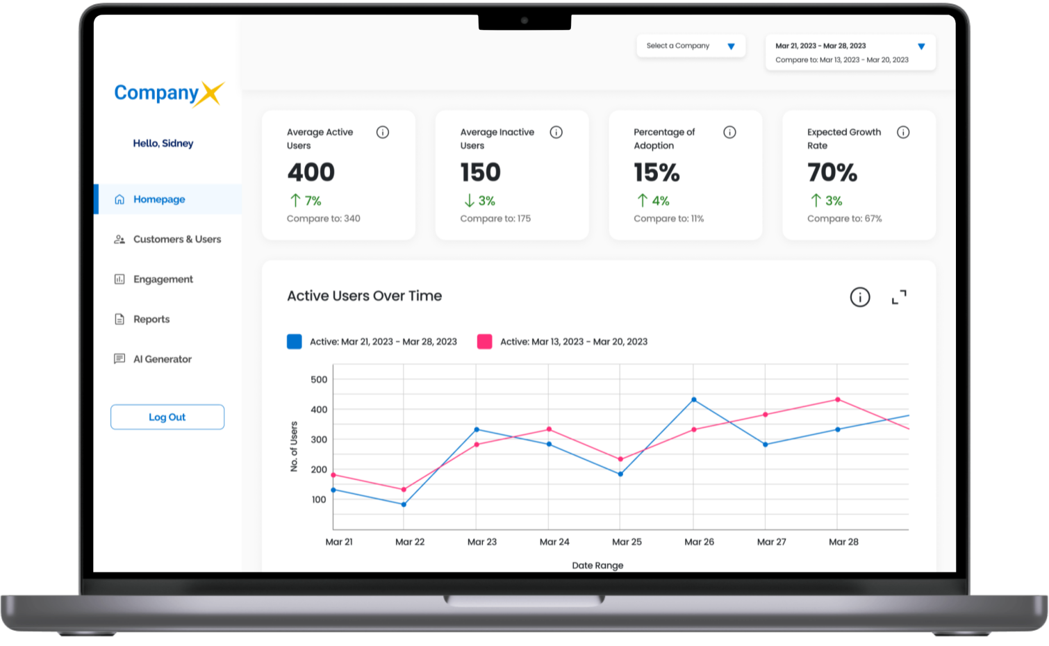
Sofvie Data Dashboard
Streamlining data access and analysis by creating internal dashboard
Timeline
March - April, 2023
4 weeks
My Role
Product Designer
Communications Lead
Project Planner and Manager
Tools
Figma, Figjam, G Suite
Python Graph Gallery, Chart.js
Team Mates
3 product designers:
Auboni Poddar, Kaitlin King,
and Xue (Snow) Yu
Client
Sofvie provides health and safety management software for oil, mining, construction industries.
Challenge
Sofvie tasked our team with designing their first ever internal data dashboard, to identify user engagement patterns and improve business performance.
We were challenged to create a user-friendly dashboard with efficient access to critical information and clear data visualization.
Stakeholders
Project Hosts - Data Science Team
Sidney - Data Science Manager
Alison - Project Manager
Vinh - Jr Data Scientist
Sparsh - Data Analyst
End Users - Sofvie Team Leads
Gus - Chief Innovation Officer
Shelley - Client Success Manager
Wymen - Sales Director
Dan - UX + Devops Manager
Solution
Senior management spent countless hours going through Excel spreadsheets and Quickbook dashboards, and hopping on calls with teammates to find data.
Before
Data stored on Excel, Quickbook and with other teammates
Our dashboard design streamlined data access and analysis, and reduced the time it takes team leads to view and analyze critical data points by at least 50%.
After
My Key Contributions
I obtained Sofvie's buy-in for conducting user interviews through card sorting to gather crucial insights before initiating the design process.
🤝
I presented and justified our mid-fidelity designs, leading productive discussions and gaining valuable feedback.
🗣️
I optimized the team's design process through Figma’s auto-layout techniques, resulting in increased efficiency.
👩💻
Design Process
Project Goals and Requirements
Version 1.0 would be desktop-only, featuring static data points and visualizations without data manipulation or personalized user views.
Before project kickoff, I collaborated with my team to prepare questions that would uncover information about the dashboard's users, purpose and success:
During the kickoff call, our questions helped identify Sofvie's need for a centralized dashboard due to scattered data points stored across various files and platforms, and in people’s heads. The dashboard is intended to support multiple teams with company and client information.
The Need to Speak with Users
I overcame hesitancy toward user interviews by identifying stakeholder concerns and persuading with a concrete card sort approach.
Although we were provided with a list of required data points, we realized the need for a deeper understanding of:
To address this, we wanted to speak with end users and included user interviews in our project plan. However, Sofvie’s project manager believed the requirements list was sufficient, despite my explaining the reason for and the importance of speaking to end users before jumping into design.
Eventually, I identified her concerns: she feared that the interviews would be theoretical and time-consuming, and therefore not useful.
To address this, I fleshed out our user interview plan with a moderated card sort as the main activity. This approach would provide something concrete to discuss and only require about 30 minutes per interview.
Sticky notes as data points on Figjam whiteboard
By my showing rather than telling, our client was ultimately persuaded. This experience taught me the importance of coming prepared with concrete proof of concepts rather than just persuading on the merits of an idea.
Card Sorting
Beyond uncovering users’ mental models and data groupings, card sorting drove alignment, security and efficiency.
Card sorting with users - Sofvie’s team leads - helped us derive the following sitemap to organize data points onto pages and tabs for optimized discoverability:
Dashboard Site Map
In the final card sort interview with Gus, the Chief Innovations Officer and it turns out, the main sponsor of the dashboard, we discovered that the inclusion of sensitive data, like revenue data points, exceeded his original vision and scope. This insight saved us time and effort, preventing the design of unnecessary metrics and visualizations, while also enhancing dashboard security.
Sensitive revenue data points that were removed from project scope
Low-Fidelity Wireframes
We gained valuable input for iteration through communicating design rationale, discussing technical constraints and seeking client feedback.
I presented our low-fidelity wireframes to Sidney and his team, and provided rationale for the data groupings, ordering and visualizations based on our card sorting results. They gave us valuable feedback, such as consolidating separate charts and changing the visualization from one type to another. We also discussed technical constraints - certain data points became more difficult to pull into the dashboard which meant some filters we designed for segmentation would not be possible for version 1.0.
Low-Fidelity Wireframes
High-Fidelity Designs
We overcame difficulties designing high-fidelity together as a team and increased efficiency by utilizing style guide, auto-layout and components.
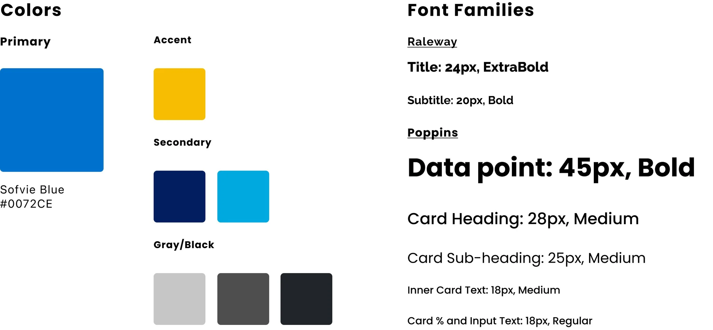
To ensure efficiency and consistency in our 4-person design team, we established Figma styles for color and typography, building on Sofvie's brand guide. We also created a grid system on Figma.
Style Guide defining colors and typography
Additionally, we utilized chart and graph options from Python and Chart JS libraries to guide higher fidelity designs, as suggested by Sofvie’s DevOps team who would be coding the dashboard.
Chart.js
Python Graph Gallery
Despite these measures, designing together still presented challenges. After creating a single page - the homepage - as a team, we discovered the need to address consistency details, such as padding and spacing between headings, legends and charts. We also realized the benefits of using auto layout and components to save time and effort while maintaining consistency. Our experience highlighted the importance of defining detailed design rules and utilizing technology to the fullest to streamline the design process.
Our Company Selector made into a component
Usability Testing and Iteration
One of the most significant user testing takeaways was concern about different interpretations of the data headings, and not understanding the data’s source.
Before
After
This feature ensures consistency and allows everyone to be on the same page, regardless of their level of familiarity with the data. We were also able to increase the overall trust in the accuracy of the data.
Final Designs
Impact
Halving Data Analysis Time, Championing UX Process, and Fostering Team Alignment with our dashboard design
50% reduction in time
All 4 team leads, who are the end users of the dashboard we designed, are confident that our dashboard would reduce data viewing and analysis time by at least 50% or more.
Successful advocate of UX process
We successfully convinced our client on the importance of direct communication between designers and end users for effective UX design. This ensured that the dashboard fulfilled the needs of the end users, rather than just assuming what they wanted.
Aligning internal teams
By having direct communication with end users, and making the CIO realize the scope creep, we also helped Sofvie’s team leads open up discussions to maintain alignment between teams internally.
Learnings
Show with concrete manifestations of ideas, don’t tell
It is more effective and persuasive to provide the client with tangible evidence of your proposed ideas, such as a quick proof of concept, instead of relying solely on theoretical reasoning or verbal explanations. This approach also ensures that everyone’s understanding of your ideas is the same.
Client Testimonials
“ One of the things that impressed me the most about Nancy was her ability to break down complex problems into clear and concise design steps. Her ability to communicate complex ideas and concepts clearly and effectively was instrumental in creating a design that exceeded our expectations. ”
Sidney Shapiro - Data Science Manager
“ Nancy's exceptional leadership skills, attention to detail, and focus on delivering high-quality results were instrumental to the project's success. She managed her team members effectively and encouraged them to exercise their skills and gain experience, which resulted in a highly motivated team that achieved excellent results. ”
Xiang (Alison) Liu - Project Manager
See More Projects
Comparion
#eCommerce
Comparing products effortlessly by tailoring to shoppers’ purchase priorities and concerns
Research + Visual Design + Prototyping + Usability Testing
House2Home
#eCommerce
Reducing decision overwhelm for young urban dwellers with items bundling in decor kits
Design Sprint + Research Synthesis + Visual Design
Kept
#Sustainability #Environmental
Reducing household food waste for home cooks with grocery documentation and more
Research + Wireframing + Prototyping + Usability Testing


